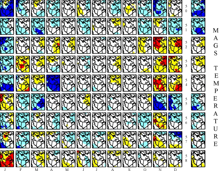
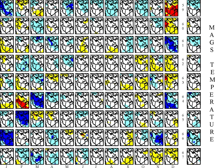
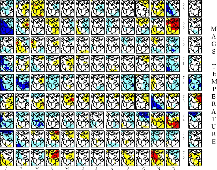
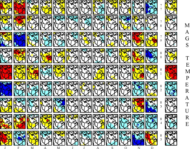
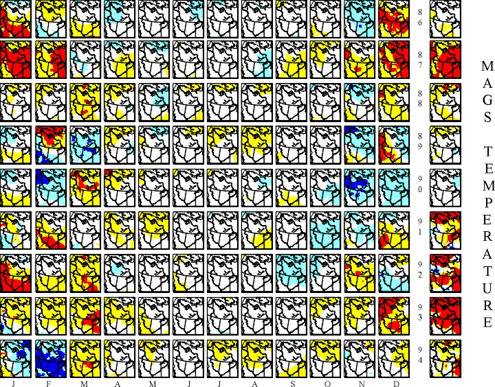
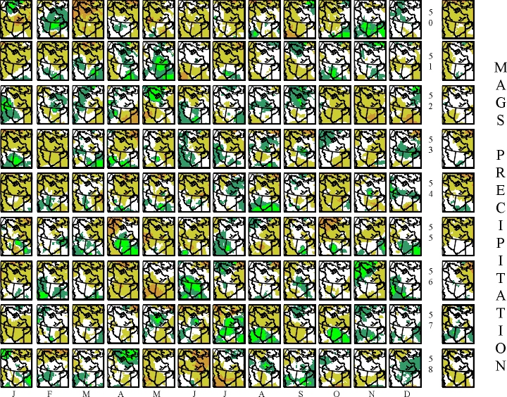
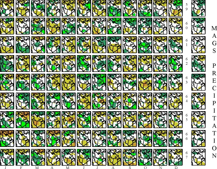
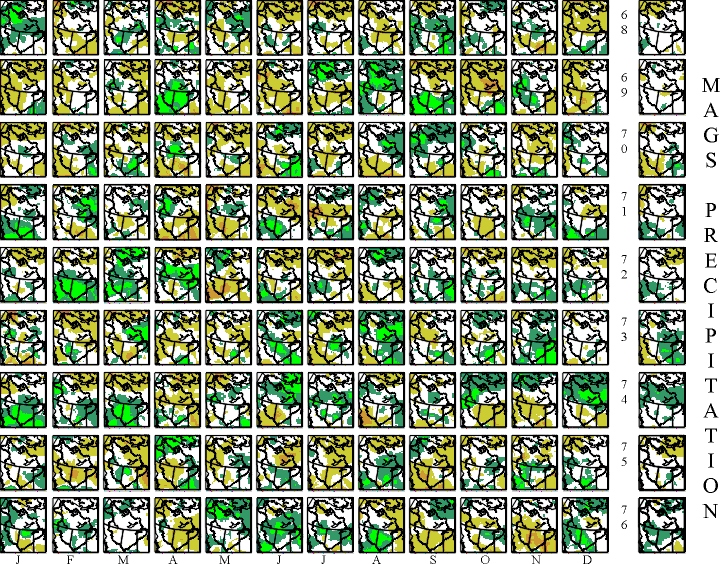
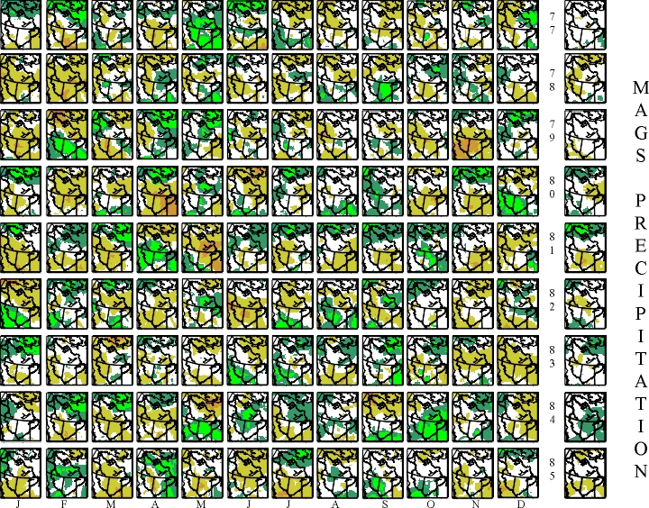
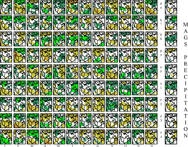

The thumbnail images of the Mackenzie Basin depict time series of monthly and annual anomalies of temperature and precipitation for the time period 1950-1994. For monthly temperature, anomalies are shown in 5 ranges separated by -6C, -2C, +2C, +6C with dark and light blue for below normal, yellow and red for above normal and white for near normal. Because the variance of annual temperature is much less, these ranges were changed to show colour and hence pattern definition on the annual maps. On the annual maps, the thresholds for colour change become -2C, -1C, +1C, +2C.
| Temperature Anomalies | ||||
|---|---|---|---|---|
| 1950-58 | 1959-67 | 1968-76 | 1977-85 | 1986-94 |
For precipitation, the anomaly is normalized by dividing by the monthly (or annual) normal precipitation ((P-N)/N). Monthly and annual precipitation anomalies are also divided into 5 categories with brown and orange depicting below normal and green and bright green above normal. Thresholds for the normalized anomaly were -.75, -.25, +.25, +.75 for monthly and -.375. -.125, +.125, +.375 for annual.
| Precipitation Anomalies | ||||
|---|---|---|---|---|
| 1950-58 | 1959-67 | 1968-76 | 1977-85 | 1986-94 |
These thumbnail sketches were generated using data from a 50 km grid of the Mackenzie. The original grid data contains full resolution, of both anomaly and actual, temperature and precipitation.